First of all, I print out all of the sketches that inspire me. I 3 hole punch them and place them in a binder with dividers. My binder is divided into sections by the number of photos included on the sketch (or magazine clipping or other inspiration). My great scrappy friend Karlyn showed me her awesome binder... and it was such a great idea, that I (copied hers) made one for myself. :)
When it's time to choose a sketch, I tend to choose my photos first. If I have 3 photos that I want to use... I go to the 3 photo section of my binder, and look for a sketch that matches the size and/or orientation of my photos. Sometimes I start with the sketch first, then go to my photo files and choose a photo that matches the design of the sketch. Either way works equally well for me!
Do you know why I love sketches?? Because they are a wonderful jumping off point. If you follow a sketch closely, the basic layout of your page is done for you. If you only choose a couple of elements to borrow, it still encourages your crafty freedom, but helps with some choices. Let me show you.
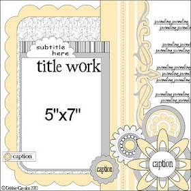
Remember Debbie's sketch that I posted on the blog in May??

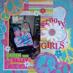
I love, love, love this sketch. I love that it uses a single 5 x 7 photo with a portrait orientation. I love the flowers and the fun border running up and down. I knew right away that I would be making a layout from this sketch. First I chose the photo, it was an easy choice. Then I chose the papers that matched my theme and would work with the sketch. I noticed that the sketch used approximately 5 papers plus a border strip. The free spirit collection by My Little Yellow Bicycle was exactly what I needed. Instead of using 5 papers, I used 3 patterned papers PLUS another piece that I cut into a border strip. I added these journaling blocks to my page to write on, instead of putting the journaling directly on the background paper. As you can see, instead of using flowers on the bottom right of my page, I let the patterned paper do the work. I hand cut peace signs right out the paper and then placed them on pop dots to give some added dimension. Thought a few more at the top left would look cute too.
I changed up the title placement, added a few sticker words, some small flowers and a big flower in the middle. That's it, a quick and easy layout.

Using sketches helps me get layouts done QUICKLY... and lately, that's important. I hope you enjoy using Debbie's sketches for inspiration. Debbie is going to be doing monthly sketches to share with us, we're SO lucky!
Thanks for taking a look, and have a great weekend. Dana

Just a quick note to let you know that a link to this post will be placed on CraftCrave today [30 Jul 12:00pm GMT]. Thanks, Maria
ReplyDeleteInteresting!
ReplyDeleteI really need to try this. I think it will be a fun way to get started with my pages!
ReplyDelete